[ Updated for Silverlight 2 ]Hi all,
In this post I will explain how we can make a customized slider from the default one. Silverlight makes customizing a control very easy. We will concentrate on the design part only and try to do total thing without looking to the xaml code.
Here is how it will look finally.

Upper one is the default one and the lower one is the customized one.
Silverlight separates a controls programmatic behavior to its look and feel. Changing one of them does not affect the other.
Now here we will modify the look and feel of it. In other words we will change the default Template" or "Skin" the slider.
We will try to modify it in expression blend because though theoretically it can be done from Visual Studio practically it is lot more easier in blend.
Now first we have to understand Silverlight slider control consists of different parts. First of all it has vertical and horizontal part. Here we are using Horizontal one and that is default. Each of them consists of same set of components. Here we will concentrate on horizontal one but same concept will be applied for vertical one also.
Now Make a project in blend named SliderSkinningExample. Now add one slider control to it and give it a width of 400. It will now look like the top one in the previous image. Now right click it in interaction window and click edit control parts then create a copy.

We can create and empty template too. But as a slider contains different parts it is easier to make a copy of the default one and have some changes in it.

Now name the template to MySliderSkin. Now we have two choices of placing the template either in the same document or in the App.xaml. If you define it in App.xaml (Application) it will be accessible from anywhere in your page whereas this document will only make it available to the current usercontrol. Here we will define it in document. I will explain why later.
Now you will see the parts of the slider like the following.

Now we can see there is a main root grid and two child grid inside it; HorizontalTemplate and VerticalTemplate. Each has two repeat buttons and one thumb and one background rectangle. (They also ve one HorizontalTrackRectangleDisabledOverlay, ThumbDisabledOverlay and
VerticalTrackRectangleDisabledOverlay rectangle but we will not consider them for now.)
The main theme for the slider looks somewhat like the following. (Considering only the horizontal part)
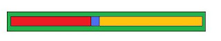
The blue part is the thumb that tells what the current position is. Green part is the background rectangle. Red part is the "HorizontalTrackLargeChangeDecreaseRepeatButton" and the orange part is the "HorizontalTrackLargeChangeIncreaseRepeatButton".
Here we will be considering only the horizontal one. Make the vertical template part's visibility collapsed.
Now we will have to skin 4 components of the slider to get what we want.
1. Background Rectangle: (TrackRectangle). Make its height 12, RadiusX and RadiusY to 5, StrokeThicknes 1. Now we will apply some gradient to its Fill.

We have 3 gradient stop. Left and right one to #FF3F3F47 and middle one to #FF202022. We will leave other properties of this rectangle unchanged.
2. HorizontalTrackLargeChangeDecreaseRepeatButton: We can not directly change it as it is a control. we have to again make a template for it. RightClick it and create a copy of the default template. You will see only a Grid inside it. Have two rectangles inside the root grid. (Make the root grid opacity to 100% as by default it is set to zero.
a) First rectangle: Set its width auto, height 10, stroke thickness 0. Make horizontal and vertical alignment to stretch. RadiusX and RadiusY to 4 (as this is slightly smaller than the background rectangle we are setting the RadiusX and RadiusY to 4 insteed of 5).
Fill this rectangle with the same style gradient, only make the gradient stop colors #FFEAC6C6 for left and right and #FFF7F7F7 for the middle. Set left margin 6.
b) Second rectangle: The purpose of this rectangle is to hide the rounded corner of the first rectangle to the right side. See the following two images to get the clear idea.

Without the second rectangle.

with second rectangle.
Copy the first rectangle. Make horizontal alignment of the second rectangle right and have a width of 10 and height of 10. Keep radiusx and radiusy 0. Set the right margin to -2. (You will not see it like the above image as we did not skin the thumb yet.)
3. HorizontalThumb: Make horizontal thumb height and width to auto. Create a copy of the template for HorizontalThumb. Delete everything inside it except the root grid. Have two ellipse inside it.
a) Outer ellipse: Height and width 18. Stroke thickness 2. Fill radial gradient. Left and right of gradient stop color #FF000000 middle gradient stop color #FFF0F0F4. Stroke color #FF555555.
a) Inner ellipse: Height and width 5. Stroke thickness 2. Fill #FFFFFFFF. Stroke color #FF727070. Horizontal and vertical alignment center.
4. HorizontalTrackLargeChangeIncreaseRepeatButton: No need to change.
Now the slider should look like the above one.
To apply this style to a new slider drag a new slider in the page and right click it and select edit control part -> apply resource -> MySliderSkin.

Unto now we never seen the xaml that is created for this. Frankly we don't have to. Just to know what blend has created for us lets see it in xaml view in blend or open it from Visual Studio.
Everything has been created inside UserControl.Resources tag. We can copy this to App.xaml also and only have to change to Application.Resources from UserControl.Resources. If you carefully see you will see there are something called VisualState and VisualStateGroup inside the xaml code. They are used for handling different states like mouse over, pressed , focused etc. They can be controlled from blend design view though we are not doing anything with them in this example.
Another thing: We did not created the style in Application level because if we create it we can not use blend for making templates for the inner controls of the slider like thumb. This problem is likely to be fixed in later versions of blend.
Please leave a comment if you have any doubt or if you found some error in this.
I am trying to build some simple Silverlight application at home and I will share them once finished. I am also thinking of changing the colors and modifying this blog a bit. Bye for now...


 We have completed our picturization and now that it really looks like a basket ball court, let's begin with the animation!
 To adjust the timeline, you just have the drag the white point! It is so easy!! Let us see the final animation!


